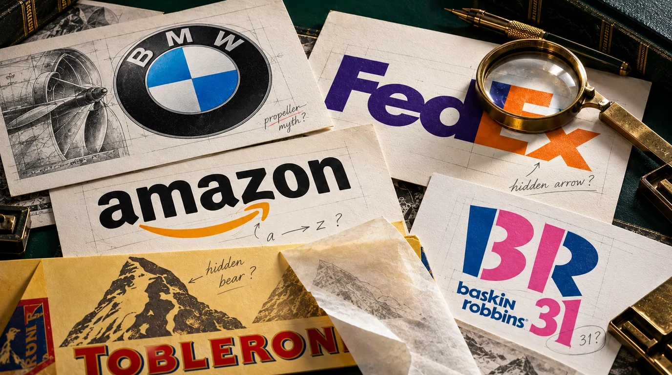
Most “hidden meanings in logos” lists copy each other. Here is the same list, sorted by what the evidence actually supports.
Ask a room of people what the BMW logo means and most of them will tell you it’s a spinning propeller against a blue sky, a nod to the aircraft engines the company built before it made cars.
It isn’t. It never was.
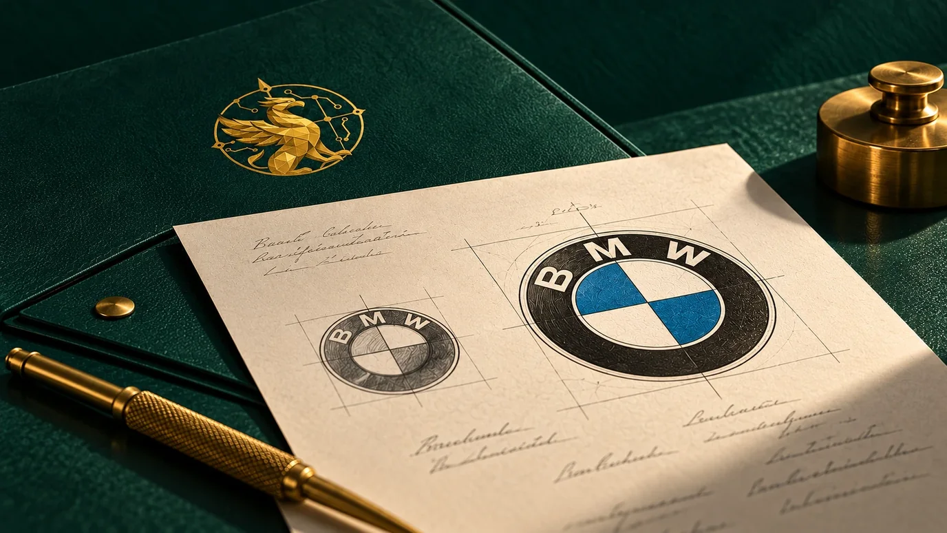
The roundel uses blue and white, the state colours of Bavaria, set in four quarters inside the ring. The propeller idea traces to a BMW advertisement from 1929 that put the roundel inside a spinning aircraft propeller to sell an aero engine. BMW leaned on the image again in a 1942 in-house publication, and after that the story ran on its own. In 2020 the company set the record straight: Fred Jakobs of BMW Group Classic said constant repetition had turned the propeller into a “self-propagating urban myth.”12
There’s a better detail hiding behind the myth. BMW says the colours appear in reverse order to the Bavarian flag because trademark rules at the time barred national symbols from commercial logos.3 The real story is a workaround, not a propeller.
I bring this up because the internet is full of articles on hidden meanings in famous logos, and most of them repeat the same list without checking it. Some entries are real and documented. One of the most celebrated was an accident. At least one is folklore. So here’s the list again, sorted by what the evidence supports.
The documented ones
Amazon: an arrow from A to Z
The arrow under the wordmark runs from the a to the z, and it curves into a smile. Both readings were intended, and you don’t have to take anyone’s word for it. When the logo launched in January 2000, Amazon’s own press release said that “a smile now begins under the a and ends with a dimple under the z,” to show the store sold everything from A to Z and that customers were happy about it.4 The design came from the agency Turner Duckworth.5
This is the cleanest case on the list. A company said what it meant at the time it meant it, in writing, and the document is still online.
Baskin-Robbins: the 31 in the letters
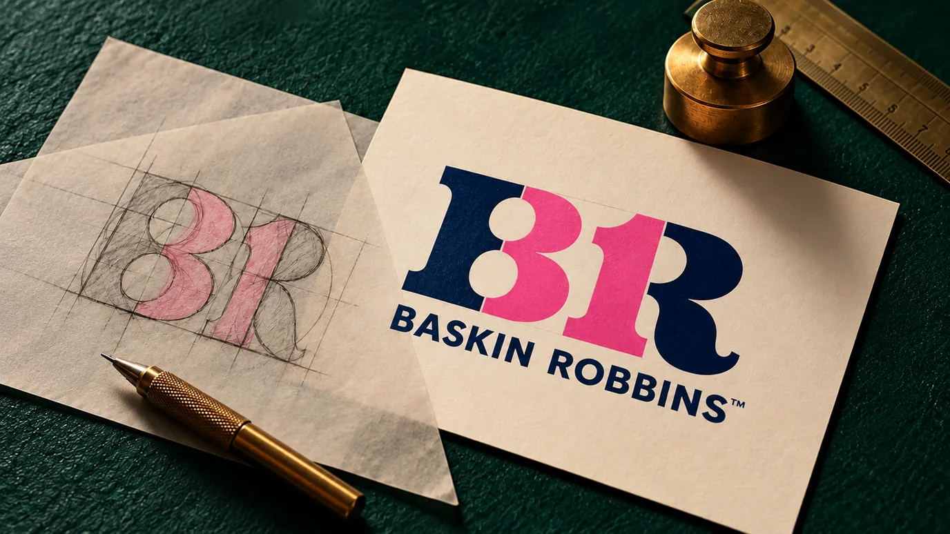
Look at the pink parts of the B and the R and you’ll find a 31. The founders offered 31 flavours so customers could try a different one every day of the month, and the number has been part of the brand for decades.6
What changed in 2006 was where the number lived. The previous logo showed a 31 next to the name. The 2006 redesign moved it inside the letters.7 So the hidden 31 is real and deliberate. It’s also younger than most people assume.
The accident
FedEx: the arrow nobody planned
There’s an arrow in the white space between the E and the x. If you’ve never seen it, go and look. You won’t be able to stop seeing it.
Most design articles present this as a stroke of planning. The designer disagrees. Lindon Leader, who led the work at Landor Associates in 1994, told CNN: “Farthest from our minds was the idea of an arrow.”8
The arrow turned up in a round of tightly spaced letter studies. Leader noticed a rough, clumsy version of it between the E and the x. No off-the-shelf typeface would make it clean, so he drew custom letters, blending Univers 67 and Futura Bold, until the arrow read clearly.9
That second part is the part worth keeping. The arrow was luck. Redrawing an alphabet to protect it was not.
The one that met a trade rule
Toblerone: the bear in the mountain
The mountain on the pack was the Matterhorn, and there’s a bear standing inside it. Toblerone was created in Bern in 1908, and Bern is the city of bears: one sits on its coat of arms. The hidden bear is newer than the chocolate, though. The Matterhorn arrived on the packaging in 1970, and illustrator Andrew Davidson added the bear silhouette in 1990.10
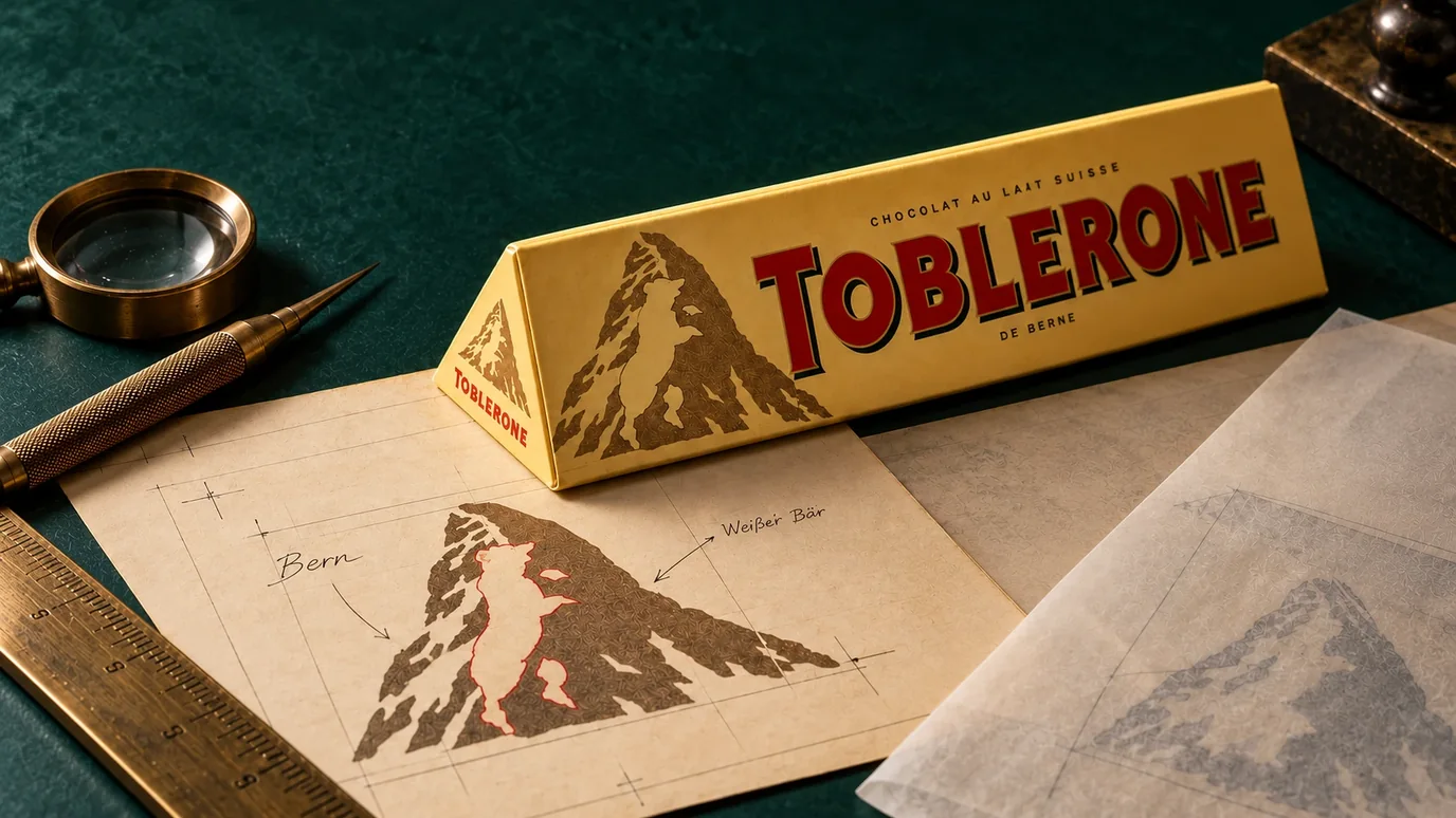
Then the business caught up with the graphic. In 2023 Mondelēz moved part of Toblerone’s production to Slovakia. Switzerland’s “Swissness” rules limit national symbols to products that meet Swiss-made criteria, and the Matterhorn is about as national as a symbol gets. The real mountain came off the pack and a modernised, generic one replaced it.1112
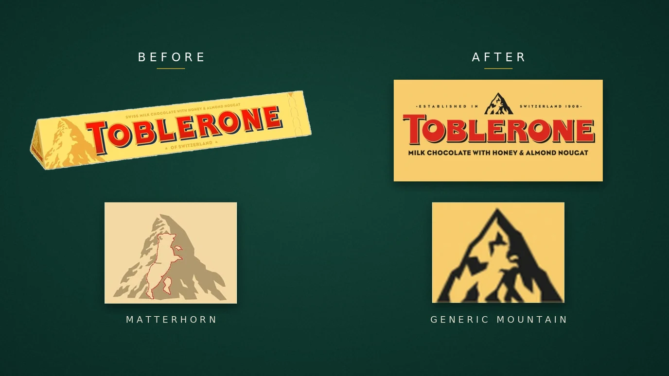
The bear survived. The company said so in plain words: “The famous hidden bear is retained.”11 A detail that started as a designer’s wink outlasted the national landmark it was hiding in. I find that funnier than it probably deserves.
The meaning should be yours to set.
Our brand strategy and creative direction work starts with what the brand should mean, then designs the logo, colour and type system that carries it. You own every asset.
Begin a ProjectWhat the pattern tells you
Two things come out of this list once you stop treating it as trivia.
The first is about craft. The FedEx arrow is famous because somebody spotted an accident and then did the work to keep it. Most design work dies in the middle, in the rounds of edits where the interesting thing gets smoothed out because nobody could explain why it mattered. Having the idea is the easy half. The skill is recognising one when it shows up uninvited, then staying stubborn about it through production. Type choices work the same way; our guide to the best free logo fonts on Google Fonts covers how a ready-made typeface becomes a mark of your own.
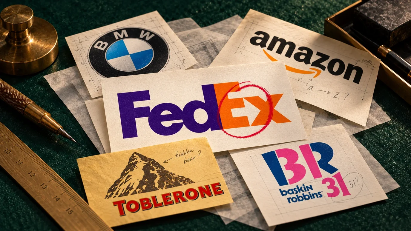
The second is about stories. BMW has spent most of a century attached to a meaning that started as one of its own advertisements in 1929, and it took the company until 2020 to correct it in public. Your customers will do the same thing to you on a smaller scale. They’ll decide what your brand means from something you said once, something a competitor said about you, or a review from four years ago. You don’t get to approve it. You only get to keep telling the true version until it travels further than the other one. That’s why memorable brands repeat a small number of things with discipline, and why a rebrand works only when the story changes along with the logo.
Which is most of what brand work is, once you take the pictures away.
Sources
- Africa Check: BMW logo not propeller, self-propagating urban myth
- BMWBLOG: BMW sets the record straight on the meaning of its logo (2020)
- The Drive: What the BMW logo really means, and no, it's not an airplane propeller
- Amazon press release (January 2000): new logo communicates customer satisfaction and A-to-Z selection
- Phaidon: How Turner Duckworth created the Amazon smile logo
- Baskin-Robbins: Celebrate 31
- The Takeout: these snack logos are hiding their secrets in plain sight
- CNN Style: Follow the arrow, hidden designs in famous logos (2018)
- Retail Brew: How FedEx's secret arrow was created accidentally
- Raconteur: The man behind Toblerone's bear-in-the-mountain logo
- ABC News: Toblerone to change Matterhorn packaging under Swissness rules
- Swissinfo: Matterhorn to disappear from Toblerone chocolate bars
Reviewed October 2026. Logos and packaging change, so check the brand’s current materials before quoting any detail as current.
Frequently Asked Questions
Is the BMW logo a propeller?
No. The roundel uses blue and white, the state colours of Bavaria. The propeller story comes from a 1929 BMW advertisement that placed the roundel inside a spinning propeller, and BMW publicly corrected the myth in 2020.
Was the FedEx arrow intentional?
It was found, then kept on purpose. Designer Lindon Leader told CNN the arrow was not part of the plan. He noticed a rough arrow between the E and the x during letter studies, then drew custom letters to make it read clearly.
What does the Amazon logo arrow mean?
Two things, both intended. The arrow runs from the a to the z to say Amazon sells everything from A to Z, and it curves into a smile for customer satisfaction. Amazon explained both in its January 2000 press release for the logo.
What is hidden in the Toblerone logo?
A bear, standing inside the mountain. Toblerone comes from Bern, whose coat of arms carries a bear. When production partly moved to Slovakia in 2023, the Matterhorn was replaced with a generic mountain, but the company kept the hidden bear.
Why is there a 31 in the Baskin-Robbins logo?
The founders offered 31 flavours, one for every day of the month. Since the 2006 redesign, the pink parts of the B and the R form the number 31 inside the lettering.
Should a small business hide a meaning in its logo?
Only if it stays simple and still works when nobody notices it. A clear, distinctive mark that reads at small sizes matters more than a hidden detail. If a meaning appears naturally during design, keep it and protect it; don't force one in.
Add us as a preferred source and Google shows our guides more often in Top Stories and AI answers.
Let’s build what’s next.
Tell us where your brand is headed, and we’ll reply within one business day with where to start.