i.
Brand Strategy
Positioning, archetype, value proposition, messaging pillars. The argument the brand makes for itself, on one page. Everything else flows from this.
Strategy, identity, naming and art direction for ambitious Vancouver and Canadian businesses — built as a system, not a logo, and made to outlast the trend cycle.
A logo is one tile in the grid. The brand is the grid — mark, type, colour, voice, photography direction, motion, and the rules that let strangers extend it without losing the thread.
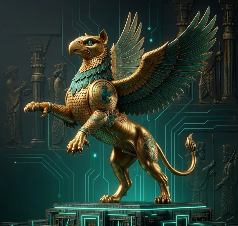
On the right: a sample showing how identity components live together. Every brand we build comes with a written system, not a single PDF.
Most agencies treat these as separate disciplines billed by separate teams. We treat them as one practice — because they only really work that way.
Positioning, archetype, value proposition, messaging pillars. The argument the brand makes for itself, on one page. Everything else flows from this.
Mark, wordmark, monogram, lockup system. Typography pairing, colour palette, supporting graphic elements. Built to scale from favicon to billboard.
For new brands and new products. Linguistic exploration, trademark check, .com availability, stakeholder testing. Coordinated with your IP lawyer; we don't file.
Photography and illustration direction. Mood boards, shot lists, photographer briefs. We art-direct shoots; we work with your photographer or one of ours.
The written system. Logo usage, type rules, colour with hex/CMYK/Pantone, voice + tone, do's and don'ts. Delivered as editable Figma + PDF.
For rebrands and launches. Stationery, social templates, signage, presentation deck, internal launch comms. The first 90 days of the new brand in the wild.
Most agencies show client work and hope you connect the dots. We'd rather show you ours and let you judge whether the system actually holds together — logo, mark, type, palette, tone of voice, photography. You're looking at it now.
See the brand pillars in our Studio, or read the case studies.
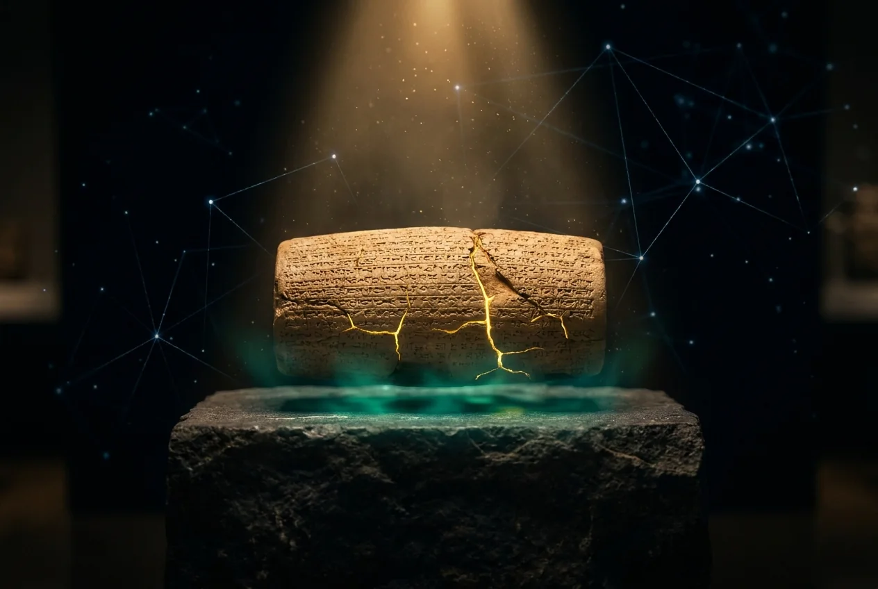
Carved permanence · House mark
A brand designed without understanding the business is decoration. The first two weeks are interviews and pattern-finding.
Founder interviews, customer interviews, competitive scan, archetype work. The strategy brief everything design-side will trace back to.
Three distinct visual directions. Mark, type, colour exploration. One safe, one bold, one “you didn't know you needed this.”
Direction chosen. Identity system built out: lockups, applications, supporting graphics, photography direction. Two structured rounds of refinement.
Brand book finalised. Assets exported in every format. Editable Figma + PDF + raw source files. Brief walkthrough call with your team.
Brand work isn't a retainer — it's a project with a beginning and an end. Billed in three milestones: kickoff, mid-point, delivery.
Logo system (mark + wordmark), colour + type palette, mini brand guidelines. Three concepts, two rounds of revision. Best for new businesses or simple refreshes.
Brand strategy, full identity system, brand book, naming if needed. Three concepts, three rounds. Best for serious launches and category-defining brands.
Multi-brand architecture, naming, trademark coordination, launch campaign, rollout assets. The full 12–16 week rebrand.
A paragraph is plenty. We'll come back inside one business day with the right tier, the right timeline, and three reference points for the direction.
The new identity needs a feed to live in. Social Media is the daily expression of the brand book.
Read the practice →
A clearer brand lowers your cost-per-click over time. Strong recognition shortens the journey from impression to clicked.
Read the practice →
GBP photos, cover image, post creative — all are brand surface area. A scattershot brand reads as a scattershot business.
Read the practice →