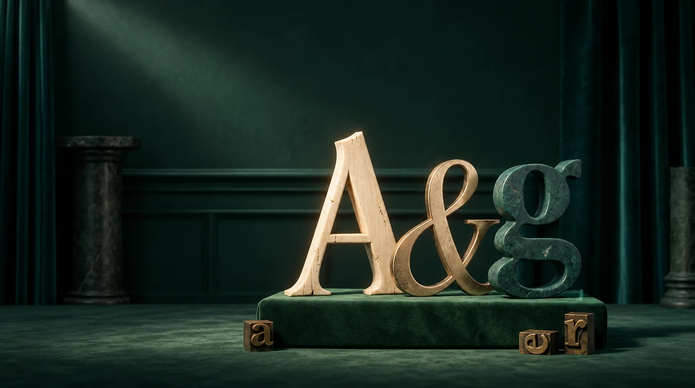
A practical guide to choosing a free typeface that fits the brand, survives real-world use and doesn’t look like a template.
Choosing a logo font is not a beauty contest
A typeface can look perfect in a saved Instagram post and fail the minute it becomes a real logo. The hairlines disappear on a phone. The wordmark becomes unreadable on a storefront. The only available weight is too delicate for a website button. Or the font has so much personality that every other part of the brand has to compete with it.
That doesn’t mean free fonts are a compromise. It means the choice needs a little more thought than scrolling until something feels expensive. Google Fonts contains serious, well-made families that can support a polished identity. The useful question isn’t “which font looks luxurious?” It’s “which font expresses this brand, in this name, at the sizes and places where people will actually see it?”
This guide narrows the list to eight free typefaces with distinct personalities and practical value. Some are dramatic. Some are quiet. Some are best used almost untouched; others need spacing, drawing or custom letter work before they become a convincing mark. Each recommendation includes the place it works, the place it tends to fail and a pairing direction for the rest of the brand system.
The short answer
The best free logo fonts on Google Fonts are Bodoni Moda, Playfair Display, Cinzel, Cormorant Garamond, Italiana, Marcellus, Tenor Sans and Josefin Sans, each one suited to a different kind of brand. If you need a fast shortlist:
- Bodoni Moda for fashion, beauty and high-contrast editorial identities.
- Playfair Display for warm, story-led brands that want sophistication without feeling cold.
- Cinzel for formal, monumental or heritage-led names.
- Cormorant Garamond for romantic, artistic and highly expressive wordmarks.
- Italiana for delicate, minimal fashion and skincare identities.
- Marcellus for calm, classical and enduring brands.
- Tenor Sans for understated contemporary identities.
- Josefin Sans for geometric, stylish and approachable brands.
Don’t choose from the description alone. Set the actual brand name in the font. Try the awkward letter pairs. Test the longest and shortest versions. Then shrink it until it is roughly the size of an Instagram avatar or a mobile header. A logo has to keep working after the mood board is closed.
Can Google Fonts be used in a commercial logo?
For the eight families in this guide, yes. Their Google Fonts metadata lists the SIL Open Font License (OFL). The official Google Fonts FAQ says its catalogue is open source and can be used commercially, and the OFL’s own guidance explicitly includes use in logos, websites, books, posters and artwork.12
There is still an important distinction. A font licence gives you permission to use the typeface under its terms; it doesn’t clear your final wordmark as a trademark. Two businesses can legally use the same font and still create marks that are confusingly similar. If the name, market or final design carries meaningful legal risk, run a proper trademark search with qualified counsel.
Modification is also permitted under the OFL, which is helpful when you want to redraw a terminal, connect two letters or create a custom alternate. The extra rules become relevant if you redistribute the modified font software itself, especially where a Reserved Font Name applies. Editing letter outlines for a finished logo is not the same thing as releasing a renamed font family, but read the licence before distributing font files.
How we selected these fonts
This is not a list of whatever happens to be popular. Each typeface had to clear five practical tests:
- A recognisable voice. The design should contribute something beyond “serif” or “sans serif.”
- Useful word shapes. The capitals, lowercase forms and punctuation need enough character to build a memorable name.
- Real-world legibility. A display font can be delicate, but it can’t collapse the moment the logo gets small.
- A workable family or a clear role. Multiple weights are useful; a single-weight font can still succeed if it is used deliberately.
- A licence that supports commercial use. Every font below is listed by Google Fonts under the OFL.
Quick comparison
| Font | Feels like | Best for | Pair with |
|---|---|---|---|
| Bodoni Moda | High contrast, dramatic | Fashion, beauty, fragrance, editorial | Inter / Source Sans 3 |
| Playfair Display | Warm, sophisticated | Hospitality, publishing, founder-led | Source Sans 3 / Open Sans |
| Cinzel | Monumental, formal | Heritage, property, museums | Lato / Manrope |
| Cormorant Garamond | Romantic, refined | Jewellery, beauty, fine art | Work Sans / Montserrat |
| Italiana | Delicate, couture | Fashion, skincare, interiors | DM Sans / Inter |
| Marcellus | Classical, calm | Jewellery, wine, architecture | Open Sans / Lato |
| Tenor Sans | Quiet, modern | Interiors, wellness, galleries | Cormorant Garamond / Libre Baskerville |
| Josefin Sans | Geometric, stylish | Lifestyle, studios, cafés | Lora / Merriweather |
1. Bodoni Moda
High contrast. Dramatic. Polished.
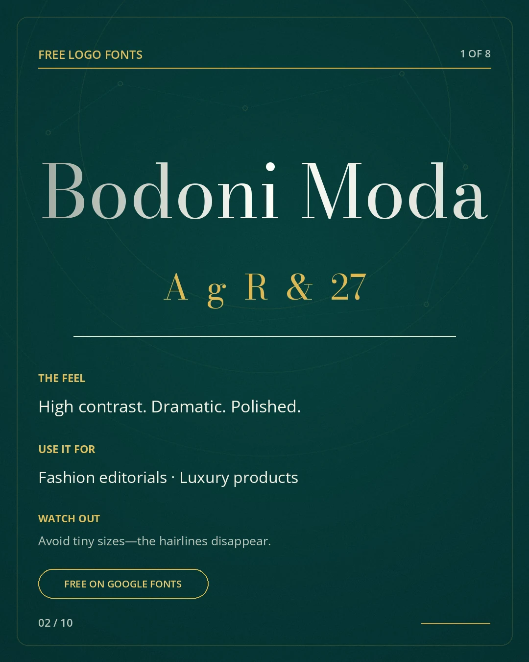
Bodoni Moda brings the tension people usually mean when they ask for a logo to feel “fashion.” Thick vertical strokes sit beside very fine hairlines, so even a simple word can feel staged. Google Fonts describes it as a Bodoni for the digital age, with multiple weights, italics, OpenType features and optical sizes.3 That breadth is useful when the identity needs more than one beautiful headline.
Where it works. Use it for fashion labels, premium beauty, fragrance, editorial products or a hospitality brand with a formal point of view. It is strongest when the name is not too long and the layout gives the letters room to breathe.
Watch out. The danger is scale. Fine strokes can break up in embroidery, foil, social avatars and low-resolution screens. Test the lightest parts early. If they disappear, move to a sturdier weight or simplify the final drawing. Don’t solve the problem by adding a heavy shadow; that usually blunts the reason you chose Bodoni in the first place.
Pairing direction. Pair it with a restrained sans such as Inter or Source Sans 3 for navigation and body copy.
2. Playfair Display
Warm. Sophisticated. Story-led.
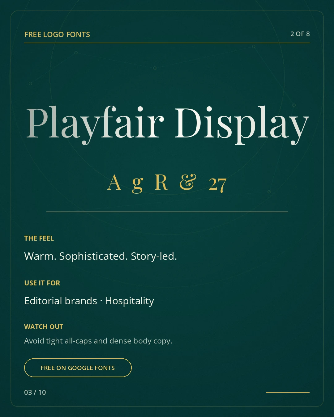
Playfair Display feels literary rather than severe. Its contrast and generous curves give it editorial presence, while the forms remain familiar enough to support hospitality, publishing and founder-led brands. Its historical roots sit in the late eighteenth-century shift from broad-nib writing tools to finer steel pens, a useful clue to why it feels both traditional and sharp.4
Where it works. It works well when a brand needs polish without the emotional distance of a pure fashion face. The italic is especially useful for an expressive second line or a short descriptor. Angarum uses Playfair in its own visual language for exactly this reason: it can carry a thought, not just decorate it.
Watch out. Avoid tight all-caps, crowded tracking and paragraphs of small copy. Playfair is a display family; let it perform where people have enough space to notice the rhythm. In a logo, inspect the capital P, R, A and the relationship between round and straight letters in the actual name.
Pairing direction. Pair it with Source Sans 3, Open Sans or another neutral sans that doesn’t imitate its personality.
3. Cinzel
Monumental. Formal. Established.
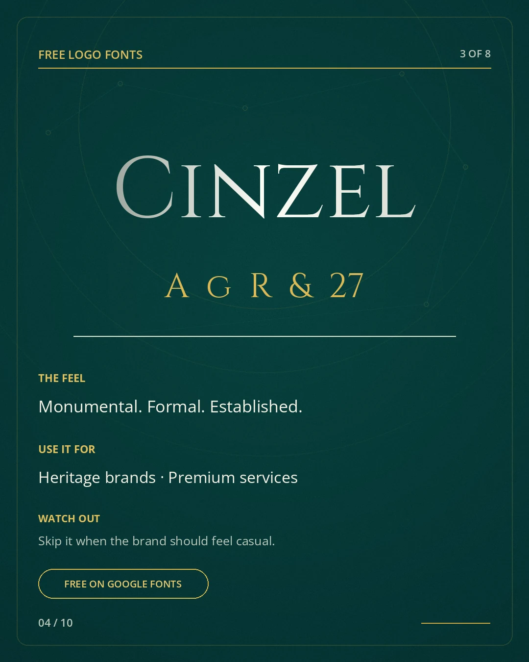
Cinzel takes its cue from classical Roman inscriptional capitals, then cleans the idea up for contemporary use. That gives even a new business a sense of ceremony and permanence. It can make a short name feel carved rather than typed.5
Where it works. Use it for heritage hospitality, high-end property, museums, premium professional services or a brand whose story genuinely involves tradition. It is especially effective for short uppercase names with clear spacing.
Watch out. Skip it when the business needs to feel casual, fast, youthful or conversational. Cinzel carries authority whether you ask it to or not. Overuse of wide tracking, gold foil and classical symbols can push it from established into costume. One historical cue is usually enough.
Pairing direction. Pair it with Lato, Manrope or another contemporary sans to stop the broader system becoming theatrical.
4. Cormorant Garamond
Romantic. Refined. Distinctive.
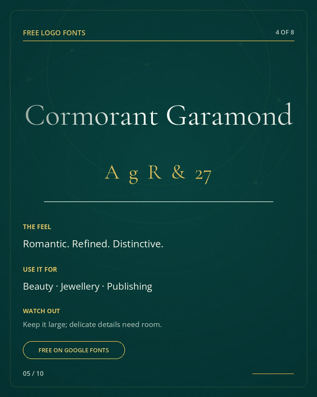
Cormorant Garamond has a more eccentric silhouette than a standard book serif. Its narrow proportions, long details and unusually expressive italics can make a wordmark feel designed before any letters are redrawn. The larger Cormorant project includes many styles and weights, which gives a brand team room to build hierarchy beyond the logo.6
Where it works. It fits jewellery, beauty, fine art, publishing, floristry, boutique hospitality and brands that can carry a little romance. Use it large enough for the details to register. A single italic word can be more effective than an entire identity set in italics.
Watch out. Its delicacy is the point and the risk. Small applications can turn into grey texture. Watch counters, joins and thin diagonals. If the logo must be stitched, stamped or laser-cut, prepare a simplified production version instead of forcing one master file to do everything.
Pairing direction. Pair it with Work Sans, Montserrat or a similarly clean sans for practical information.
5. Italiana
Delicate. Couture. Minimal.
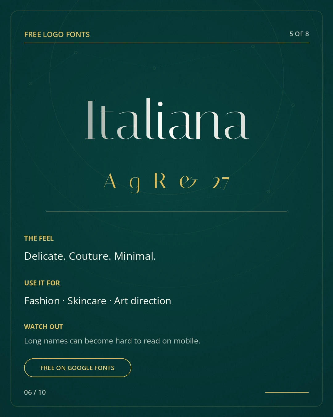
Italiana was designed with newspaper and magazine headline use in mind, drawing on Italian typographic traditions. Its narrow, poised shapes bring elegance without the heavy contrast of Bodoni. It is especially convincing when the art direction around it is quiet.7
Where it works. Use it for fashion, skincare, art direction, interiors or a small luxury brand that values restraint. It can turn a compact name into an elegant masthead and works well with generous whitespace.
Watch out. Long words and small mobile placements are its weak point. The design can become fragile if squeezed into a horizontal navigation bar. Check the name at real phone size, not at 200 percent zoom on a laptop. If the identity relies on one delicate lockup, create a compact secondary mark for small spaces.
Pairing direction. Pair it with DM Sans or Inter to keep digital interfaces direct and usable.
6. Marcellus
Classical. Calm. Enduring.
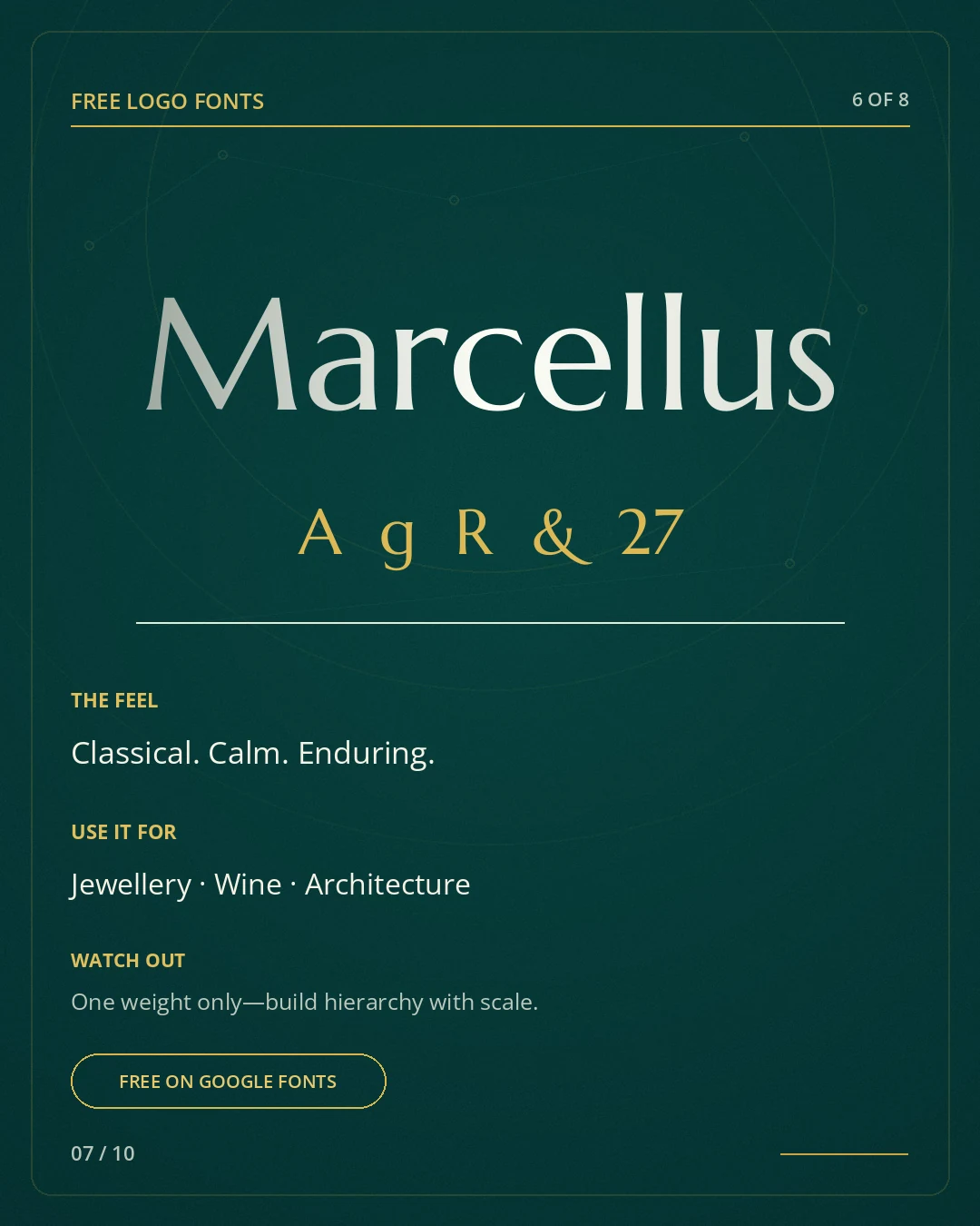
Marcellus is a flared serif inspired by Roman inscriptional letterforms. Compared with Cinzel, it feels quieter and less ceremonial. That balance makes it useful for brands that want history in the room without turning the room into a temple.8
Where it works. It is a strong fit for jewellery, wine, architecture, premium food, private clubs and established service firms. The capitals are clear, and the modest stroke contrast survives production better than many fashion serifs.
Watch out. The family offers limited weight variation, so hierarchy needs to come from scale, spacing, colour and a supporting typeface, not a fake bold button. Synthetic bolding damages the proportions and often closes the counters.
Pairing direction. Pair it with Open Sans or Lato for long copy and functional digital components.
7. Tenor Sans
Quiet. Modern. Understated.
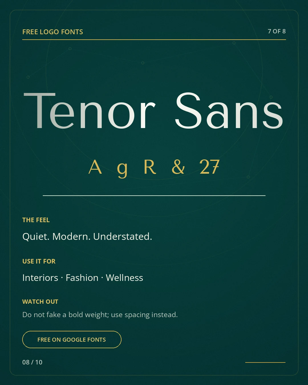
Tenor Sans is the option for brands that want to look considered without looking ornate. Google Fonts describes it as a humanist sans intended for both body text and headlines, with legibility across print and screen. Its proportions feel calmer than a geometric startup sans and less corporate than many neutral grotesks.9
Where it works. Use it for interiors, architecture, wellness, fashion, galleries or a thoughtful service business. In uppercase with careful spacing it can feel remarkably premium. In sentence case it becomes warmer and more accessible.
Watch out. Don’t manufacture weights the family doesn’t have. If a platform applies fake bold, the curves lose their balance. Create emphasis with size, whitespace and contrast. Also resist extreme tracking: airy is not the same as disconnected.
Pairing direction. Pair it with Cormorant Garamond or Libre Baskerville when the system needs an editorial serif.
8. Josefin Sans
Geometric. Stylish. Approachable.
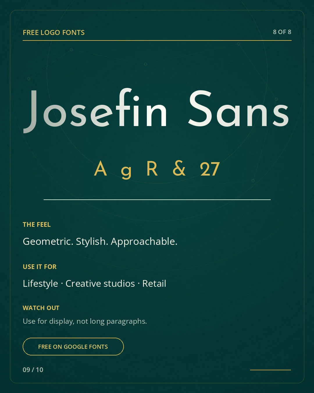
Josefin Sans combines geometric construction with a vintage, slightly idiosyncratic voice. It was conceived for larger sizes and draws on early twentieth-century geometric sans styles. The unusual x-height and letterforms give it more personality than a default modern sans.10
Where it works. It works for lifestyle brands, creative studios, independent retail, cafés and products that need modernity without tech-company anonymity. Try it in uppercase, then test sentence case; the two moods are noticeably different.
Watch out. Use it for display, not for a long paragraph just because it is available. A full website set in Josefin can feel thin and tiring. In a wordmark, look carefully at unusual characters in the name; distinctiveness is helpful only when the word remains immediately readable.
Pairing direction. Pair it with Lora, Merriweather or a neutral UI sans depending on how editorial the brand should feel.
How to make a free font feel like your logo
A licensed font is a starting material, not a finished identity. If you type the company name, choose gold and stop, the result will look familiar because it is familiar. Originality usually comes from a series of small, intelligent decisions rather than one dramatic trick. Colour choices matter here too, and our guide to colour psychology in branding is a useful companion once the letterforms are settled.
1. Fix the spacing by eye
Default kerning is built for general text, not your one specific name. Print the word large, step back and look at the negative space between pairs. Round letters often need different treatment than vertical ones. You are aiming for an even visual rhythm, not mathematically identical gaps.
2. Choose one memorable intervention
A custom terminal, a shared stroke, a redrawn crossbar or one alternate character may be enough. If every letter has a trick, the logo stops reading as a word. Keep the change tied to the brand idea or to a real problem in the letter sequence.
3. Build optical, not mechanical, alignment
Curves and pointed letters often need to extend slightly beyond a baseline or cap line to appear equal in height. Small marks may need thicker hairlines and more open counters. These adjustments are invisible when they are right, which is the point.
4. Design more than one lockup
A horizontal website header, square social avatar, storefront sign and one-colour invoice stamp do not ask the same thing from a logo. Create primary, compact and small-use versions. That is a responsive identity doing its job, not a lapse in consistency.
5. Test the ugly situations
Put the mark on a cheap office printer. Reduce it to 24 pixels. Reverse it out of a dark background. View it in one colour. Imagine embroidery, vinyl and a browser tab. A logo that only works in a polished mockup is still a mockup.
Common mistakes to avoid
- Choosing by category alone. “Luxury serif” is not a strategy; it is a shelf label.
- Copying the whole mood board. If the reference uses Bodoni, wide spacing and a monogram, borrowing all three is imitation, not inspiration.
- Ignoring the name. A font may look wonderful in the specimen word and awkward in yours.
- Using fake bold, fake italics or distorted proportions. Select a real style or redraw with intention.
- Making the logo and every headline identical. A brand system needs hierarchy, not endless repetition of the hero font.
- Relying on colour for recognition. The mark should still hold together in one colour.
- Skipping trademark research. An open font licence does not make the resulting brand name or symbol legally unique.
Which font should you choose?
Start with the adjective the brand must earn, not the adjective the founder happens to like. “Premium” is too vague. Does the business need to feel ceremonial, intimate, quiet, artistic, precise or approachable? Then choose two or three families that express that direction and set the real name, tagline and a sample headline in each. If you are still deciding what the brand should stand for in the first place, our guide to brand positioning comes before the font choice, not after it.
If the mark needs instant fashion tension, test Bodoni Moda or Italiana. For a warmer editorial voice, test Playfair Display or Cormorant Garamond. For heritage and authority, compare Cinzel with the calmer Marcellus. For a contemporary identity, begin with Tenor Sans or Josefin Sans.
Then stop looking at type specimens. Put the candidates into the actual brand system: website header, social avatar, proposal cover, packaging or signage. One option will usually begin to make better decisions around it. That is the one worth developing.
A font can start the identity. It cannot finish it.
These eight Google Fonts can all produce strong logo directions. None of them can decide the positioning, voice, colour system, image language or rules that make the brand recognisable over time. That work is where a logo stops being a nice word and becomes part of a usable identity.
If you are choosing between typefaces but the brand still feels interchangeable, the problem may not be the font. That is usually a sign the position underneath the logo hasn’t been decided yet, which is exactly the part worth getting right first. If it helps to see how the fundamentals fit together, our walkthrough on how to build a brand from scratch covers the order of operations.

A font can start your identity. We finish it.
Our brand strategy and creative direction builds the position first, then designs the logo, colour and type system that makes it recognisable. You own every asset.
Begin a ProjectReferences and official font pages
- Google Fonts FAQ, licensing and commercial use
- SIL Open Font License, official licence information
- Bodoni Moda, Google Fonts specimen
- Playfair Display, Google Fonts specimen
- Cinzel, Google Fonts specimen
- Cormorant Garamond, Google Fonts specimen
- Italiana, Google Fonts specimen
- Marcellus, Google Fonts specimen
- Tenor Sans, Google Fonts specimen
- Josefin Sans, Google Fonts specimen
Reviewed September 2026. Font licences can change, so always confirm the licence shown on each family’s Google Fonts page, and treat trademark clearance as a separate legal question from font licensing.
Frequently Asked Questions
Are Google Fonts free for commercial logos?
The fonts in this guide are open source under the SIL Open Font License and can be used commercially, including in logos. Always verify the licence shown for the individual family, and remember that trademark clearance is a separate question from font licensing.
Can I modify a Google Font for a logo?
Yes, the OFL permits modification. If you distribute a modified font file, additional naming and licence conditions can apply. Converting a wordmark to outlines and editing its letters is different from publishing a new font family, and it's the normal way custom logo lettering is made.
Should my logo use the same font as my website?
Not necessarily. The logo may use a display face while the website relies on a more practical family for navigation, body copy and accessibility. They need to belong together, not be identical. Many strong identities pair a distinctive logo typeface with a plainer, highly legible font for the interface.
What is the best free font for a luxury logo?
There is no universal winner. Bodoni Moda feels dramatic, Italiana feels delicate, Cormorant Garamond feels romantic and Tenor Sans feels quietly premium. The best choice depends on the name, audience and production needs, so test your actual brand name in two or three before deciding.
Does using a popular font make a logo generic?
Only if the decisions stop at the font menu. Spacing, custom drawing, proportion, colour, supporting typography and the wider identity can make a familiar typeface feel specific. A rare font does not automatically create an original brand, and a common one does not doom you to a generic mark.
Can I make the font wider or narrower for my logo?
Avoid stretching type with transform handles, because it distorts stroke weight and curves. Use a legitimate width axis when the family offers one, choose another family, or redraw the wordmark carefully by hand. Mechanical stretching is one of the most visible signs of an amateur logo.
Add us as a preferred source and Google shows our guides more often in Top Stories and AI answers.

Let’s build what’s next.
Tell us where your brand is headed, and we’ll reply within one business day with where to start.